This is by way of comment on Stig's Burn's Birthday blog (and probably won't be seen by anyone other than Stig and Cameraman anyway, but I'm fine with that).
Here's a couple of supermarket haggises for anyone who ISN'T Stig or Cameraman:
Wednesday, 28 January 2009
Tuesday, 27 January 2009
Monday, 19 January 2009
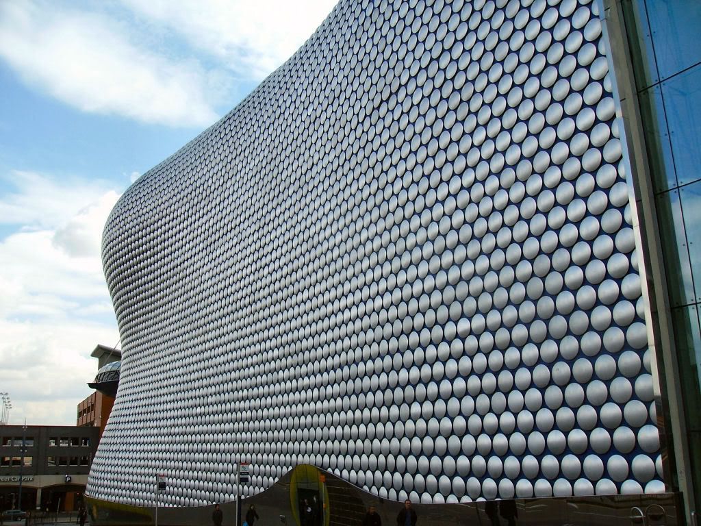
Picture Post (Selfridges)
(Blogger has done something strange with the picture links in this post. I'm in no condition to correct things right now so I'll leave things as they are for the time being. All my photos are on Photobucket)
This is sort-of inspired by Stig's exposé about his geekery. One of my own geekish weaknesses is architecture. I can't say I'm particularly knowledgeable about it, but few things are as likely to make me hold my breath or stop me short as a striking or beautiful building.
Well-designed, well-constructed and properly functional buildings really are works of art in the truest sense of that word. I live in a city which was famed for a lack of taste or foresight on the part of its planners and architects in the 1960s, which brought about some of the ugliest and badly-built major developments in the UK and wider.
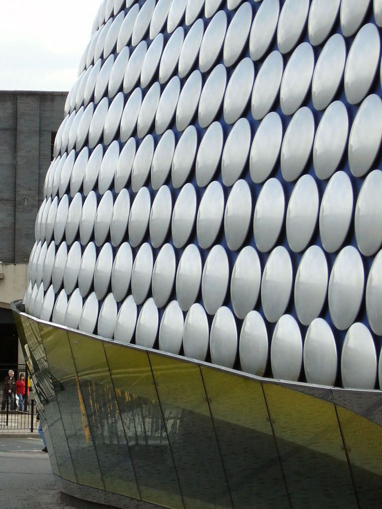
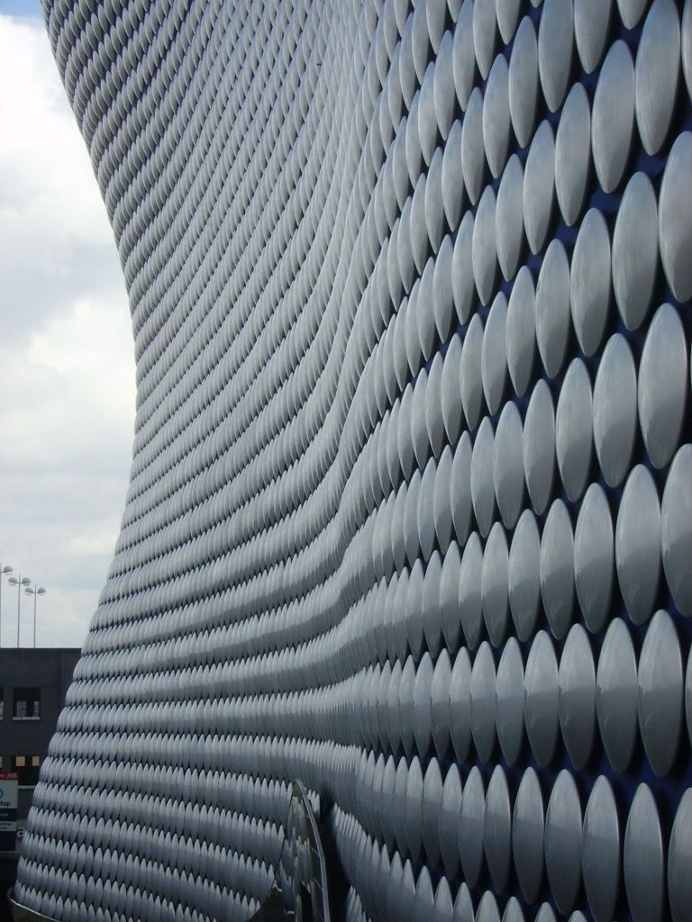
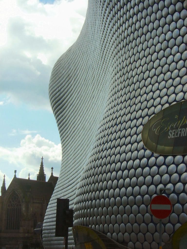
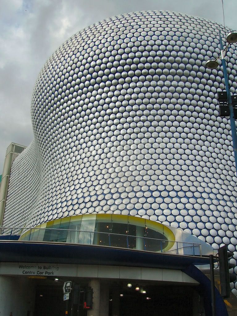
More recently, the Birmingham skyline has seen some stunning additions to its skyline and this post is about one such building. It's famous in its own right, has won all kinds of awards, and is well-represented all over the internet (a google images search results in 19,000 pictures).
So here are some more pictures of Future Systems' Selfridges department store. I am particularly mindful of it this week, as its designer, Jan Kaplický suddenly died last week and this is my little insignificant tribute to a great man.
I fell in love with the idea of this building before I ever saw it, as various impressions of the designs were floating around long before construction began six years ago. One of the many wonders of this building is that there are no flat surfaces outside - everything is curved; sometimes very obviously, sometimes less so. At the time, one of the statements made about the building was the promise that the Selfridges name would never have to appear on the outside: the building would be striking enough for a name-plate to be unnecessary. Regrettably, a few years down the line the Selfridges people clearly decided that wasn't enough and they put a huge neon sign in the only street-facing window, which I think sort of spoils the effect.
Anyway, enough of my jabber-jabber, here's a load of photographs, all taken by me over a period of about two years, arranged more or less in order from the Moor Street point of connection with the rest of the Bull Ring Centre around to the St Martin's Square point of connection. It's built on a hill and of the many entrances, there are three at street level, and they lead to three different levels!
Labels:
architecture,
birmingham,
bull,
future,
geek,
kapliky,
ring,
selfridges,
systems
Friday, 16 January 2009
Hat-making your way out of poverty
Last week, a film came out here in the UK which, despite technically being a UK production by most criteria, has been out for a while in several places around the world (most notably the USA, whose public acclamation precedes it here).
The film features a television game show from which it would appear that hat-making is a popular (but no less competitive) route out of poverty in India.
Or am I misunderstanding the show's catch-phrase title of Who Wants to Be A Milliner? ;-) (At least that's the way it sounds when Anil Kapoor says it!)
(For the record, I recommend Slumdog Millionaire very heartily)
Labels:
dev patel,
kapoor,
Millionaire,
pronunciation,
sarcasm,
Slumdog
Subscribe to:
Posts (Atom)